Just got these zines from No. Zine. I have blogged about them a million times before. I just wanted to show all the little details like the stamp on the front, the two colours throughout the books and the black staples. All of these look amazing and make me want to buy more, which is obviously the point. I want my zine to have some nice details in like this, not just a zine but something a bit more.
Thursday, 3 June 2010
Urban Outfitters Look Book
This is another look book that I picked up in the Sates. It's a really cool layout, again printed on shit stock, the cover is un-coated and the inners are coated. This type of layout seems to be very 'in' at the moment, I personally really like it and try and use it more and more. It is structured whilst looking pretty free. The whole center aligned type and overlapping onto images is something I also draw inspirations from.
Bibliography
Books:
Parra , (2009) And Press, ‘A Book Full of it’
Harrington. S, (2009) Arkitip, ‘Issue No. 0052’
Hayes, C (2009) ‘Gig Posters – Rock Art of the 21st Century’
Maki (2009) ‘The art of the T-shirt’
Perry. M, (2007) Princeton Architectural Press, ‘Hand job: A Catalogue of type’
Fluff – Nike SB
Juxtapoz, (2009) Ginko Press, ‘Book of Poster Art’
Non Format, (2007) Die Gestalten Verlag, ‘Love Song’
R. Klanten, S. Ehmann, A. Mollard, (2009) Regular Graphic Design
It’s Nice That (2009) It’s Nice That 2
It’s Nice That (2010) It’s Nice That 3
N. Parapone, J. Dillon (2009) Print Liberation
Heller, S (2004) Design Literacy: Understanding Graphic Design, New York: Allworth Press
C. Fiell, P. Fiell (2005) Graphic Design Now
A. Shaughnessy, T. Brook (2009) Studio Culture
Magazines:
Grafik Magazine
Eye Design
Creative Review
Arkitip
Fluff Magazine
Websites:
These are just some of the things that I have been looking at for this FMP. There are obviously lots of other things that I have been looking at but have forgotten/not written down. My fault.
Process - Grids
This is just a quick example to show people that it is a tight grid that I use and stick too, they images that may look a little scattered aren't ever really scattered, they have been stuck into a 8 column grid with a baseline grid for the bottom of the images and text. This works well and look great once the grid is turned off.
This is pretty much what I use for most of my work but have now upped it too a 12 column grid.
Process Poster
I thought I may as well have a go at a poster that showcases the book. I have used the same images that are on the cover as I have on the poster in the same style, gridded but looking scattered. I have also mentioned what is in each section i.e. processes and designers. I think this poster will look nice next to the book and it is something a little extra if the book was a product.
The book has come and it looks amazing, the same weight, size and feel of the look book I blogged about, but with different feeling paper, still recycled, but coated.
Tom Sandberg - Posters
These are some posters from Thomas Sandberg. I really like the idea of having some posters that come free with a photography book. It showcases the photography and would become the talking point of a room. These are really cheap and are given away with any purchase on the site Hassla (the three last posts on the blog are from Hassla).
Love and Before, Green and After - Marcelo Gomes
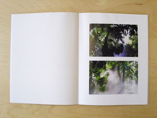
This is a photography book that stand out quite a bit. The cover is simple and too the point with some nice and simple type. The inside has a different array of images. It has different sizes and different layouts. This is something I would like to incorporate for my book. I really think that different sizes work.
Subscribe to:
Posts (Atom)


