Monday, 22 February 2010

Saul Bass - Hitchcock Posters


These are some of the original posters that were done by Saul Bass for Alfred Hitchcock films. They are somewhat iconic in the design and film industry. People recognize that these styles of posters are for Hitchcock films because they are so influential. This is exactly what i want to get away from when producing my posters. These sharp cut edges and bold colours, hand made and hand cut type are exactly the style I want to change. This is so my posters aren't obvious to people seeing them. They will have to read them to see that they are what they are.

A perfect example of people doing things the same as Saul Bass for Hitchcock films is one that I blogged earlier on in the year when I found them. They are posters by Matt Needle, they are nice images that are completely obvious for Hitchcock films.
Richard Perez - 2001


Typographic poster for Stanley Kubrick's science fiction masterpiece. The famous quote is not included in the final version of the film but appears in Arthur C. Clakre's original book. The em dash that breaks the phrase represents the ever present monolith. The poster is set in Futura Extra Bold, (Kubrick's typeface of choice) and printed with glow in the dark ink, so the star field only becomes visual in the darkness of space.

This is a really simple idea that has been executed by Richard Perez very well indeed. He has typographically communicated the Stanley Kubrick film 2001 by using a quote that wasn't even featured in any of his film. He has done this with the colour choice and also favorite type face of Stanley Kubrick. These are all points that people wont know until they read about it. Very good.

This is kind of similar to the idea I want to use for The Hitchcock series. Kind of subliminal messages for the films. Lots of dialogue that may not even make sense but fully relate to the films content itself.

Thursday, 18 February 2010

Oliver Dexenbichler


With the useof different type faces and sizes this layout is simple and distinctive. The mixture of colour photograph and black and white really work well within the layout. I love the simplicity with the layout and the use of black and white colour. I think that the limited colour palette really makes the whole thing tie together. 
The final layout for my fedrigoni brief is simple with its layout and simple touched make it look interesting.

Friday, 5 February 2010

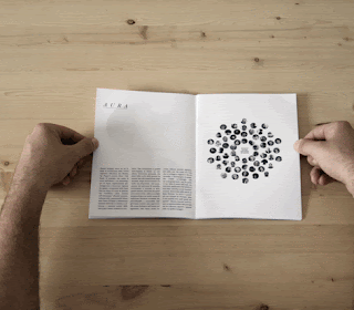
Erik Elms - Zine


This is a small Zine by creator of 'And Press' Erik Elms. He has a simple Graphic style when it comes to publications, all of his other stuff is a little more detailed and illustrative. This is a silly zine but it is really cool, nice photos, nicely laid out. Good stock choice.

Thursday, 4 February 2010

di Benedetto & Lignarolo - Poster Work


I haven put any poster work on my blog for a while. This is really nice and simple type poster, from the guys. The little tweaks on the type make the hierarchy work very well indeed. One colour, simple type. Stunning little piece. I want to keep my leaflets, fliers and posters a little more simple if it is appropriate for the brief. If it is some sort of extra to type work.


Di Benedetto & Lignarolo


This is actually and annual report for a small business. They layout is super nice and simple, not really using any bold type or anything, this creates simplicity. The simple touch of having the outer pages blue gives it that extra special feel as something of a bit more worth than a throw away.

I think open spaces and simple layout is something I will get into my zines and my Fedrigoni brief as it uses the space effectively.

Monday, 1 February 2010

Shaz Madani - 241 Mag


Large format magazine produced as part of London Fashion Week.
Photography by Mel Bles.

I think when you have a bunch of good photography on your side it is a lot easier to create something stunning. But the use of paper and type with images in this layout is really something else. Its so simple but pulls off so well.

Paper is obviously a big part of my Fedrigoni catalogue but unfortunately they haven't provied the best pictures so I cant use them in the way i relly want to, like this, large scale.

Shaz Madani - Zines


A collection of illustratuions based on superstitions and sayings created for No.Zine 1,2 & 3. A zine series produced. These are real simple with and emphasis on colour. The layout is simple which really makes you have a look at the pictures which are the main focal point.
by 
Patrick Fry featuring young artists, writers, photographers and illustrators. Each zine is themed around
the number of its issue.