Thursday, 28 January 2010

Di Benedetto & Lignarolo


A self initiated project for the designer. They build the project around paper stocks and different formats and sizes for the product which is a really good way to start designing. The layout is cool and simple, kind of zine like.

I am trying different types of formates for my Fedrigoni brief and am thinking of different ways to bind the booklet. This is great inspirations for that.
Di Benedetto & Lignarolo


This is an art book for an exhibition. Its a really simple layout with nice imagery and its saddle stitch bound. This is relevant to my practice and my Fedrigoni brief. I am using cheaper ways of printing and saddle stitch bounding to create something that isn't limited edition, but is something that you want to keep and collect.

Tuesday, 26 January 2010

Matt Needle - Hitchcock Poster


These are also re-makes of posters for popular Alfred Hitchcock Movies. I don't think they're terribly ground-breaking, but the simple use of shape and colour is in keep with the old posters and so are the type-faces. I think I will completely change the aesthetics for mine and step away from the Saul Bass approach that quite a few re-makes have already used. I want to do something different using type.


Gestuz - Flier


This is the flier to go with the catalog. It actually comes with it which is a nice touch. Once again its on a recycled stock. The layout speaks for itself and conveys the classy modern brand.

I think I will put a flier/invitation with the Fedrigoni catalog just for another little perk and show off for the paper stock.

Gestuz - Catalog


This is a catalog for a German clothing brand. I picked it up from a shop in London. The format is really cool, its newspaper size, so its printed on A2 sheets. Its all newsprint but i think it is coated newsprint because it feels a little heavier. The layout is really plain and simple and the artwork is also pretty effective. This is the format I want to use for my Fedrigoni catalog. I think it will show off the paper to designers as much as it can and exploit it to its full potential.

Monday, 25 January 2010

Because Studio - Mail Out


These are little mail - outs that the designer sends to clients. I love the concept behind them and the execution is perfect. At first the small A6 ones were printed onto any bits of card he could find, I thought that was a cool idea. He has made new ones now and he sells them a little more refined. I would like to do something like this for PPD maybe?

Because Studio


This is like a little portfolio that they send out to people. I thinks its amazing. Once again the attention to detail is cool as shit. The stitching is the same as the two colour print and you actually have to break through the outer sleeve to get into the content.

Because Studio - Postsers


I love everything about these posters, from the way they are stamped to the simple colours chosen. I think one colour prints are really effective at conveying a message. You really have to pick your colours right, so if you do a 4 or 5 colour print, the colour doesn't mean as much.

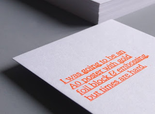
I love the attention to detail with this. I think the stamp does it for me, even though it will have been about £30 to buy.

Because Studio


I don't really like the actual design of this brochure, but the format is a good one. It looks quite thin but also quite big. I want to have a format similar so that it shows off Fedrigoni's stock.

Carine Collin - Memoire D'un Amnesique


This is a Dutch designer. He is really into layout and publishing, it takes up most of his portfolio. I love the way that this book it laid out. It is really simple but powerful on the eye. The use of image counteracts the use of type which is choses very carefully.

I want to design my Fedrigoni book using minimal colour and un-varied type faces like this so that the quality of stock speaks for itself.